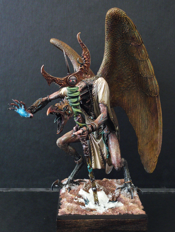
… Or how to treat a (very) large figurine.
Some deals in life are more pleasant than others, and in my case, it was a treat. To thank my webmaster for creating my website, we agreed that I would paint a large model by myself. It is this enormous bird of the Forgeworld that was chosen. This article focuses primarily on and its painting. Note that the last part, more theoretical, explains how to adapt the painting of miniatures in this scale.
Happy reading!
First step: we change!
It is obvious that this article will deal more with the techniques used for painting fis figure. However, I can’t help but note that the squatting pose for the resin kit is unacceptable. This is an arch-demon that truly needs an adjustment.
Armed with my trusty Dremel, I amputate the right arm of our bird, and part of his ribs. The limb was previously bent at right angles and lifted up to heaven, but I want it to be bent 30/45 ° and pointed forward. Then I glue together the different pieces in order to adjust to the desired pose.

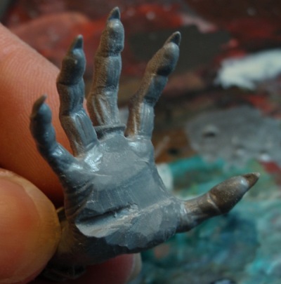
I cut and sand the inside of the hand to make it perfectly smooth.
I cut a very large part of the neck, just to shorten it and change the tilt and angle of the head. I connect the body and head with a brass rod, having previously drilled in each part.
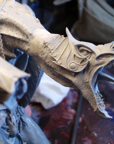
Then I glue it all and fill the space with Magic Sculpt before re-sculpting the original texture.
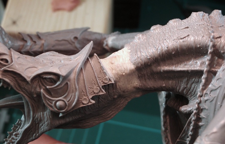
I attack the sculpture of the tunic. Nothing complicated, I just need to take into account the new fabric tension and create corresponding folds. Once done, I also re-sculpt the trim of the garment to keep its continuity.
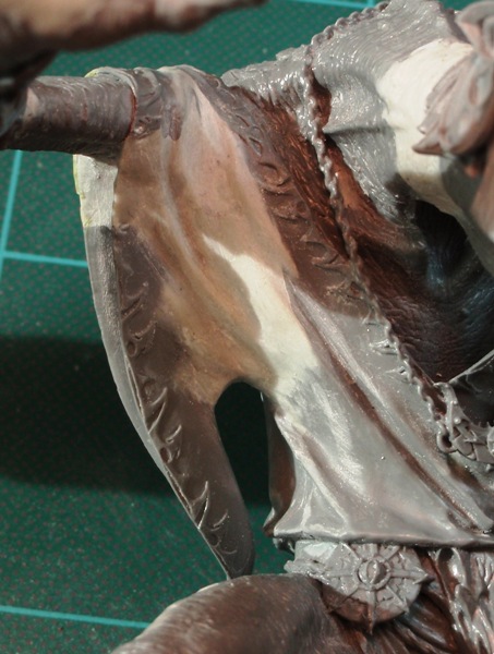
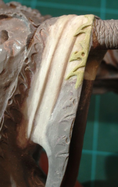
All that remains is to finish assembling and base-coating the figure. It is now ready to be painted!
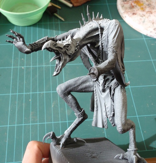
Skin
The first thing I do is apply a red color (P3 Sanguine Base + GW Red Gore) with an airbrush on all skin areas.
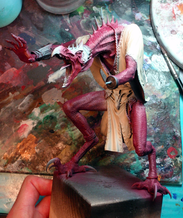
I then do the same thing to the tunic, with a solid layer of GW Bleached Bone. I start with a general base for his skin. It consist of Heartfire P3, GW Bronzed Flesh, Bleached Bone GW and white.

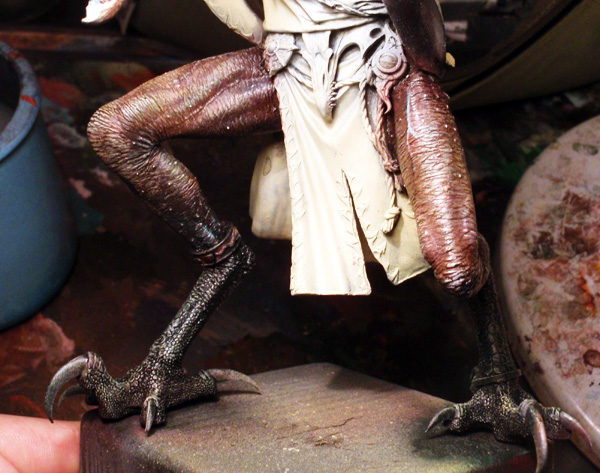
I cover the lower half of the legs with a mixture of black and GW P3 Coal Black. I make sure some red is still visible through the black. Then I just brush the entire leg with GW Bleached GW Bone.
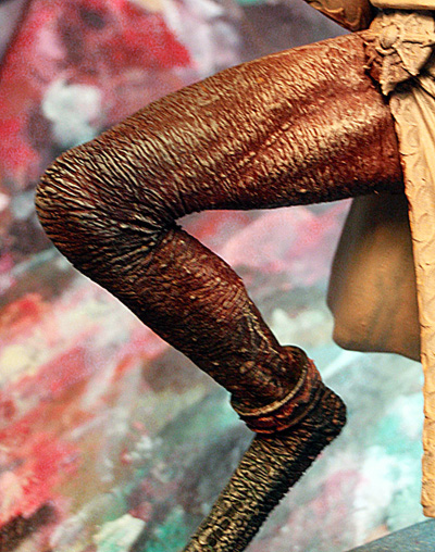
I add more matte black to the legs, brush over white and then with wash with Rackham Color Antique Green, and GW Red Gore.
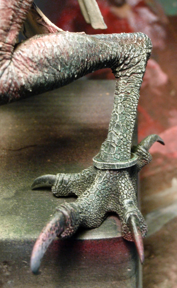
I proceed the same way with the rest of the leg, but I concentrate on the shadows and recesses with a purple and red wash.
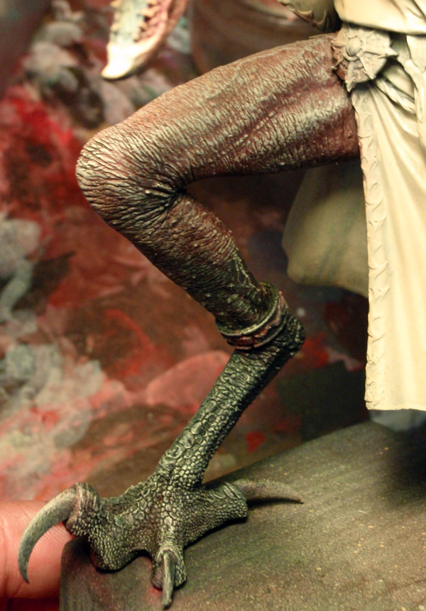
Now I can start using the colors I want to appear permanently on the thighs, as well as the matte, satin, and glossy finishes.
I start playing with the brighter washes: Gryphone Sepia, Leviathan Purple, Badab Black and Baal Red.
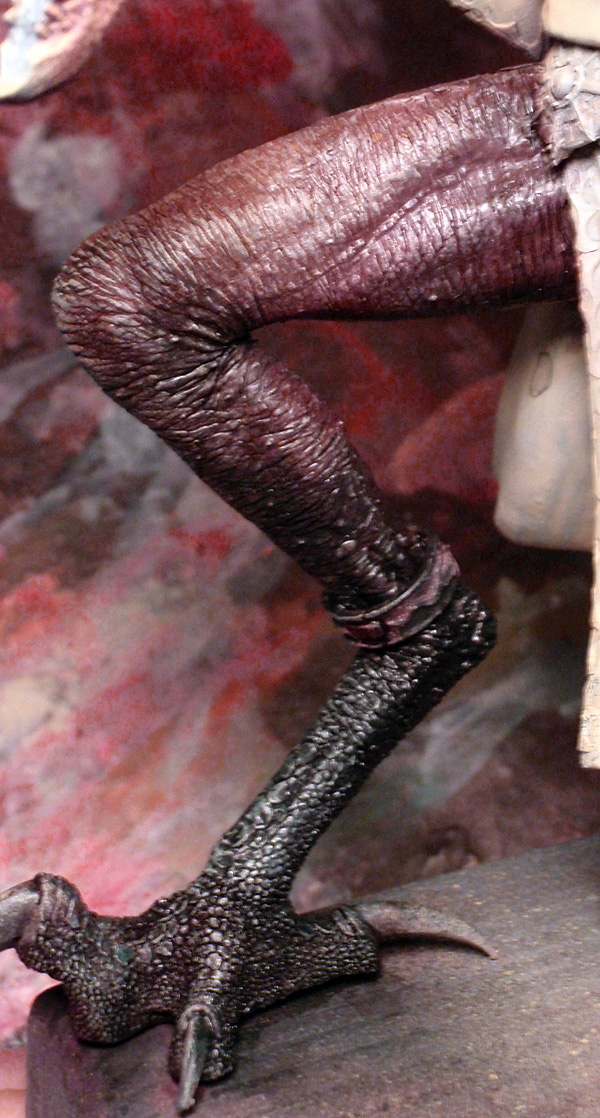
For lights, I gradually began it all with Bleached Bone, then Bleached Bone with white. You have to add a little at a time because of the texture of the skin.
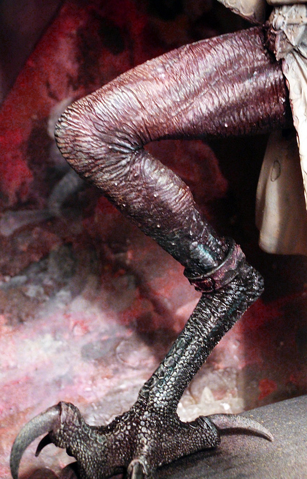
I add the final details to the skin. I return with shades of Scorpion Green GW, Gryphone Sepia, Turquoise ink + white, purple ink, red ink and red ink + P3 Umbral Umber.
Similarly, I can correct highlights by reducing, offsetting or reinforcing certain areas, either with pure Bleached Bone, or Bleached Bone with white.
I finished with a mixture of Naples yellow and Ivory Prince August.

Fabric
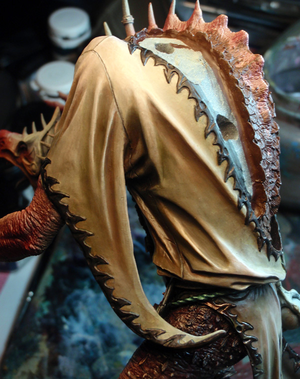
As I said earlier, the tunic is uniformly based in GW Bleached Bone.
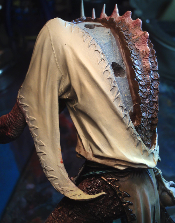
I then begin to add the shadows. For this I use a mixture of grey and green. Bastion Grey P3 for grey, and greens I use Camo Green and GW Catachan Green.
Sometimes I will occasionally use grey mixed in the P3 Umbral Umber and Sanguine Base P3 for a few places.
Considering the surface, I will mark the shadows as general areas, rather than clearly defined spaces.
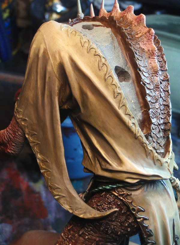
Now it is time to add highlights. Here Bleached Bone, then the Rose Portrait Liquitex Clear up this pure hue. I finish with Ivory Prince August.
Here the work is very rough. Once the broad areas are down we can come back to add details and refine our highlights.
The front of the kilt will have many differences in shadows, lights, and shades.
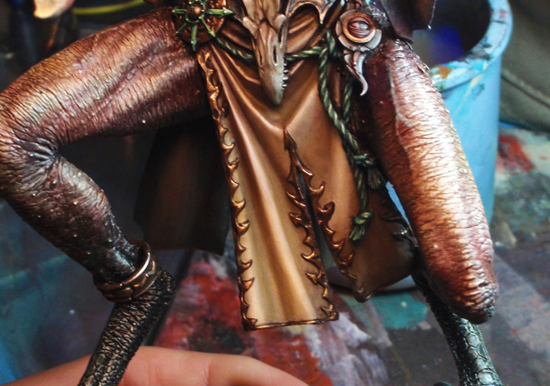
Painting an old gold
For some gold paint on the figure, I turned to a recipe from a friend, with a very yellow tint in the lights, and color in the shadows. Colored shadows do not contain metallic pigments.
I start with a base of Calthan Brown GW + Shining Gold + P3 Umbral Umber. Mixing with matte shades also helps the metal stand out much more. This enables better control and a better final result.
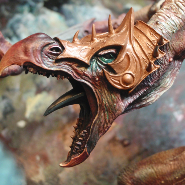
I use Umbral Umber P3 mixed with black, without it becoming pure black. You’ll read why in the last part of the article.
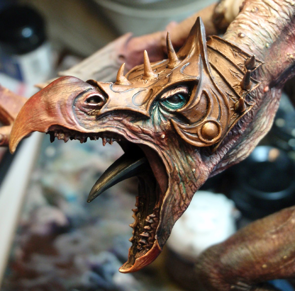
Finally, I intensify my highlights. For this I use a mix of GW Snakebite Leather + GW Burnished Gold. I add a greenish silver to all, sort of a mixture between GW Mithril Silver + GW Camo Green + yellow (this is actually the old GW Shining Gold, which goes back to the beginning of the Citadel paint line). I finally finished with chromium Prince August at the last points of light.

Be able to adapt to scale
If you were paying attention to the colors used in this article, You will notice something in particular: I have never used pure white highlights on this model or pure black shadows.
I preferred to use pink and yellow as part of my lightening, and, brown, green and dark blue for my darkening. This is due to the scale of the figure. Because of its large size, this model required an adjustment in the way I paint, so as not to overdo the contrasts.
There is a very simple example to explain this reasoning. Look at your hands. On them, you see no point of bright light at your knuckles or fingernails. There are, likewise, no black lines between your fingers. However, to make a legible hand for a smaller model, you will be forced to use white and very dark colors. As you work on larger models it becomes necessary to be more subtle and progressive with your changes in light because they’re noticeable. This is true for finishes, too. For example: one matte, the other satin.
It was also important to play at the level of saturation contrasts. The subject also allowed me to let myself go without too much risk. Large areas of blue, emerald green, carmine red and bright red, yellow or magenta were added at some locations on the skin, however, these areas were not defined at random. I intentionally placed these shades in areas where the eye comes to rest when reading of the figure, to add effect.
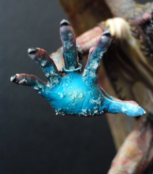
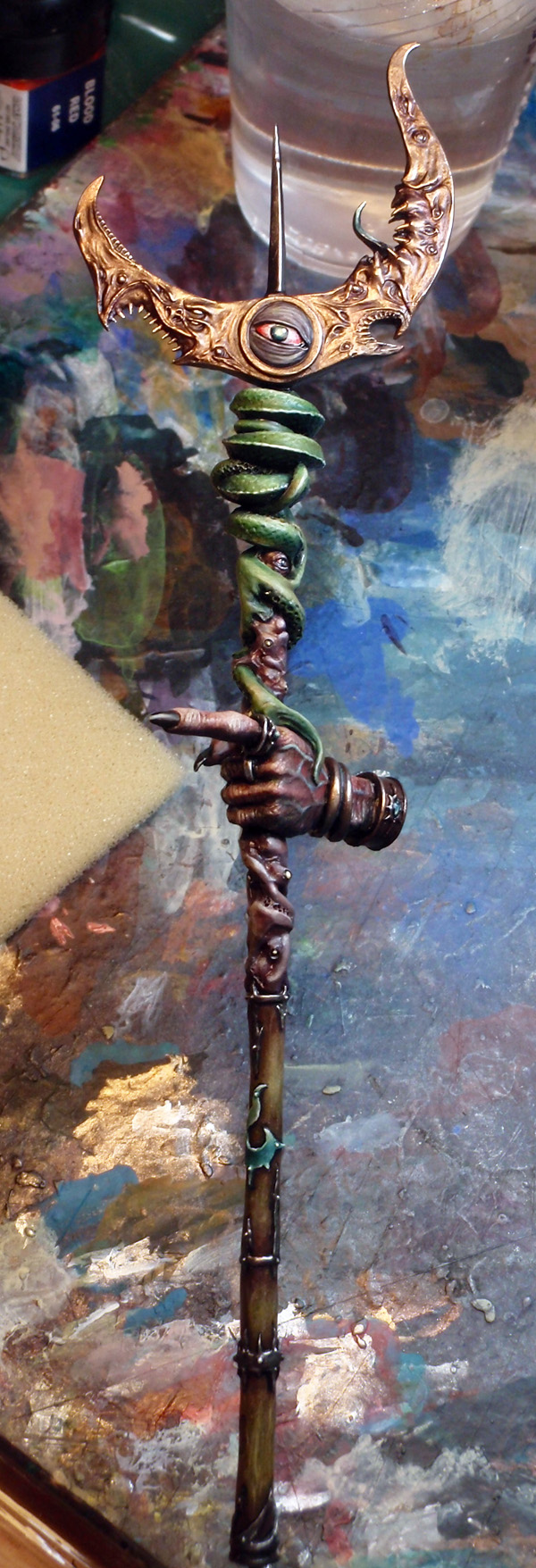
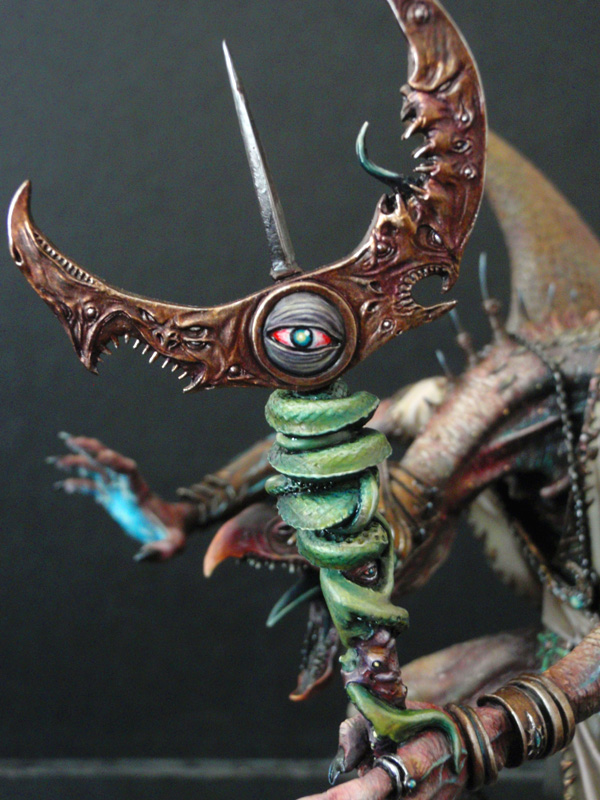
Similarly, the choice of turquoise saturated for the effect of the right hand and green foil for the “snake” of sthe staff.
A few hours later…
… Here is the finished model. This is clearly the largest figure I’ve painted to date. The experience was rewarding, both work renderings, lights, shades and textures. My webmaster is in heaven, and everyone is happy! Obviously I hope that reading this tutorial has been helpful.
If you want to see more photos of this model, just click here !
